|
How To Draw SCV
|
Welcome to where I decribe a bit about how I draw my comic. It's a farly simple process.
The hard part is really coming up with the idea I'd like use in the comic strip. For
that, I tend to go to the local pub and have a pizza and a pint of guiness and spend a
couple of hours brainstorming and writing strips. The strips usually get changed a lot
once I get down to the actual drawing. I rework the wording and often change the delivery
of the joke. Occasionally I even change the whole strip. But enough of that. This is
how to draw SCV, not how to become an embittered alcoholic wreck. Click on any of the
images for a bigger view of them.
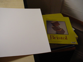 To start with, I like to work on bristol board. Mmmmmm..... bristol board. When I started out
I was drawing the strip on printer paper, which works probably about as well, but is cheaper.
The thing that drove me nuts was I would ALWAYS wrinkle it and once even ripped a strip when
I was erasing the pencilling from the strip. Bristol board absorbs ink a little more cleanly, it's definately
acid free (important if you want your comics to not yellow), and is stiff enough that my heavy
handed erasing doesn't cause problems. Since I draw at 12"x4" for my strip, 2 strips fit
nicely onto a 14x11 sized bristol board. I like doing strips 2 at a time this way. It's
a good way to get a night off periodically if you usually do 2 strips in one sitting.
To start with, I like to work on bristol board. Mmmmmm..... bristol board. When I started out
I was drawing the strip on printer paper, which works probably about as well, but is cheaper.
The thing that drove me nuts was I would ALWAYS wrinkle it and once even ripped a strip when
I was erasing the pencilling from the strip. Bristol board absorbs ink a little more cleanly, it's definately
acid free (important if you want your comics to not yellow), and is stiff enough that my heavy
handed erasing doesn't cause problems. Since I draw at 12"x4" for my strip, 2 strips fit
nicely onto a 14x11 sized bristol board. I like doing strips 2 at a time this way. It's
a good way to get a night off periodically if you usually do 2 strips in one sitting.
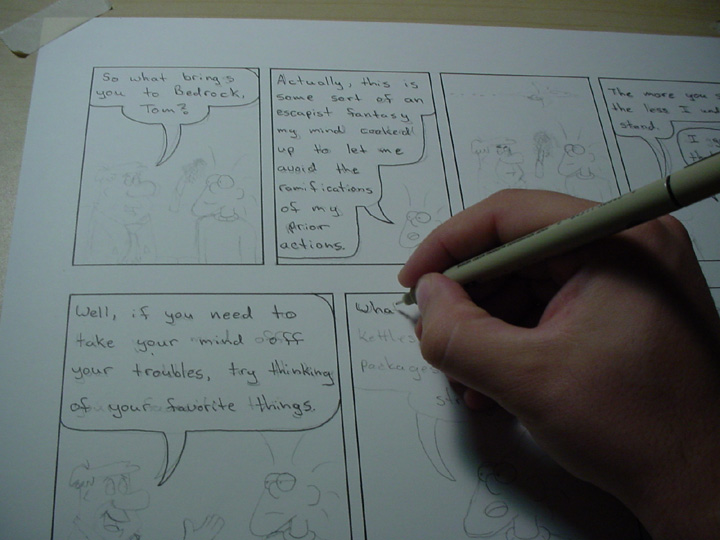
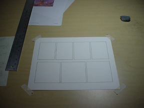 The first thing I do is draw and ink my panels. Here you see two of my standard sized rows,
a 3 panel and 4 panel strip with no sizing differentiation. My strip can be pretty wordy
at times, so often I'll stretch one of the panels and shrink others to get the conversational
sallies to fit correctly while still allowing enough room to draw a little. Damn me and my
verbosity. It'll be the death of me sooner or later. I use a .8 size Pigma Micron pen to
ink in the boarders. I've been considering switching to a 1 for thicker lines, but I'll
probably stick with .8 cause I like the tip better.
The first thing I do is draw and ink my panels. Here you see two of my standard sized rows,
a 3 panel and 4 panel strip with no sizing differentiation. My strip can be pretty wordy
at times, so often I'll stretch one of the panels and shrink others to get the conversational
sallies to fit correctly while still allowing enough room to draw a little. Damn me and my
verbosity. It'll be the death of me sooner or later. I use a .8 size Pigma Micron pen to
ink in the boarders. I've been considering switching to a 1 for thicker lines, but I'll
probably stick with .8 cause I like the tip better.
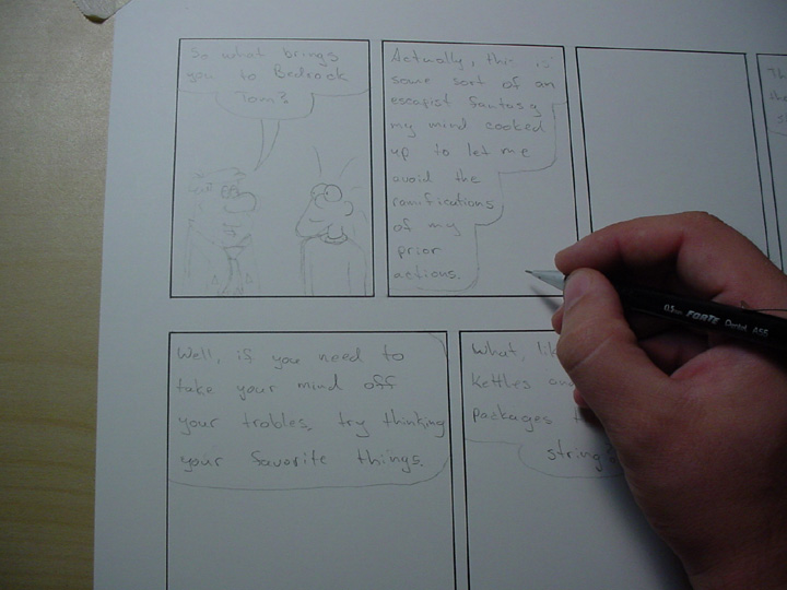
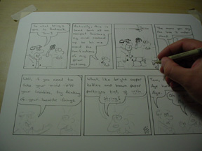
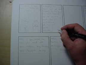 Once I have my nice clean panels to draw in, I start by doing text. Usually lots of text.
I used to use a very non-standard sort of text. Everybody, and I mean EVERYBODY, with very few
exceptions uses all capitals in the font. When I was starting this, I tried that for one
strip and didn't really like the look. And since I was drawing it basically to amuse me
and maybe two of my friends (Hi Jamie! You rule!) at the time, I figured to heck with it,
I'll write how I want to write. This led to a problem. When you use lower case letters
you can't pack your words together as much because the letter height and width is nowhere
near as regular. And I use a lot of words. Finally I bit the bullet and
changed, and I'm still getting used to the new look. But it was worth it as my dialog balloons
are much smaller leaving me with more room to draw. Of course, if you look at my artwork, you
could call that a mixed blessing at best. As you can see here, I do all the dialog for
both strips including word ballons. Then I draw the characters. Once the characters are
done, I put the pointy bit on the word balloons that point to whoever is talking. Simple.
Once I have my nice clean panels to draw in, I start by doing text. Usually lots of text.
I used to use a very non-standard sort of text. Everybody, and I mean EVERYBODY, with very few
exceptions uses all capitals in the font. When I was starting this, I tried that for one
strip and didn't really like the look. And since I was drawing it basically to amuse me
and maybe two of my friends (Hi Jamie! You rule!) at the time, I figured to heck with it,
I'll write how I want to write. This led to a problem. When you use lower case letters
you can't pack your words together as much because the letter height and width is nowhere
near as regular. And I use a lot of words. Finally I bit the bullet and
changed, and I'm still getting used to the new look. But it was worth it as my dialog balloons
are much smaller leaving me with more room to draw. Of course, if you look at my artwork, you
could call that a mixed blessing at best. As you can see here, I do all the dialog for
both strips including word ballons. Then I draw the characters. Once the characters are
done, I put the pointy bit on the word balloons that point to whoever is talking. Simple.
 Once the strip is drawn, I move onto inking. I ink all the dialog first. If I can, I tend
to tighten up the space used on the dialog at this stage to leave more room for the drawing
when I get a particularly wordy panel. I work, as everyone should, from left to right, top
to bottom. Not only does this logically follow the flow of the comic (usually) but it keeps
me from smearing fresh ink. If I were left handed, I would go insane. Or learn to write in
that neat way they do with the paper sideways to avoid smearing. The word ballons are also
inked here. Man my penmanship is attrocious! Eeeep! I ink lettering with a .05 Pigma
Micron Pen. When I was working in lower-case, I used a .03 Micron and still thought it was
"too thick" to keep the writing neat. But you have to use a pretty thick pen for dialog
because if the letters get too thin, they don't reduce well. Yet another happy result of
me finally moving to caps was thicker lines look darn clean, so now I can ink dialog with
a fatter pen, which increases legibility and decreases the area required to write. I could
go to a computer font for even tighter dialog, but I VERY much doubt I will. I like having
the dialog inked on the final product so I can hold it in my hand and read it.
Once the strip is drawn, I move onto inking. I ink all the dialog first. If I can, I tend
to tighten up the space used on the dialog at this stage to leave more room for the drawing
when I get a particularly wordy panel. I work, as everyone should, from left to right, top
to bottom. Not only does this logically follow the flow of the comic (usually) but it keeps
me from smearing fresh ink. If I were left handed, I would go insane. Or learn to write in
that neat way they do with the paper sideways to avoid smearing. The word ballons are also
inked here. Man my penmanship is attrocious! Eeeep! I ink lettering with a .05 Pigma
Micron Pen. When I was working in lower-case, I used a .03 Micron and still thought it was
"too thick" to keep the writing neat. But you have to use a pretty thick pen for dialog
because if the letters get too thin, they don't reduce well. Yet another happy result of
me finally moving to caps was thicker lines look darn clean, so now I can ink dialog with
a fatter pen, which increases legibility and decreases the area required to write. I could
go to a computer font for even tighter dialog, but I VERY much doubt I will. I like having
the dialog inked on the final product so I can hold it in my hand and read it.
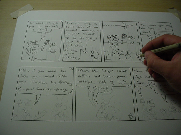
 Now that I have the dialog inked, I go back and do my detail work. I like to ink the details
with a .01 Pigma Micron pen. Is this sounding like an advertisement for their pens yet? I
like them, but most drafting quality pens are about the same. I'll get into the one thing
that I've found with these particular pens that I like so much just a little later. As you
see, I tend to ink the eyes, nose, ears, neck, and hands of Tom. Cat and Reese both have
bits of their hair inked. Lisa gets her entire hair and a good deal of her cap inked at
this point. I tend to fill in mouths completely at this point unless they are really open
wide. In Fred's hair, you can see I outlined it and thickened it. It gets filled in a
little later. Complex backgrounds often get left until later, but simple backgrounds that
don't overlap the characters much will get drawn in in this stage. I like thin lines for
details and backgrounds so that the characters and the forground items stand out. I have
a .005 micron pen that I use for tiny tiny details. However, you usually can't see them
on the web at 72dpi. If you ever see something that LOOKS like it ought to be something
but you can't quite make it out, often it's the web reduction that has blurred it out of
recognition. I like to put small "aside" jokes in like that. They are usually only funny
to me and maybe one other person, so it doesn't matter that reducing them for the web
renders them impossible to make out.
Now that I have the dialog inked, I go back and do my detail work. I like to ink the details
with a .01 Pigma Micron pen. Is this sounding like an advertisement for their pens yet? I
like them, but most drafting quality pens are about the same. I'll get into the one thing
that I've found with these particular pens that I like so much just a little later. As you
see, I tend to ink the eyes, nose, ears, neck, and hands of Tom. Cat and Reese both have
bits of their hair inked. Lisa gets her entire hair and a good deal of her cap inked at
this point. I tend to fill in mouths completely at this point unless they are really open
wide. In Fred's hair, you can see I outlined it and thickened it. It gets filled in a
little later. Complex backgrounds often get left until later, but simple backgrounds that
don't overlap the characters much will get drawn in in this stage. I like thin lines for
details and backgrounds so that the characters and the forground items stand out. I have
a .005 micron pen that I use for tiny tiny details. However, you usually can't see them
on the web at 72dpi. If you ever see something that LOOKS like it ought to be something
but you can't quite make it out, often it's the web reduction that has blurred it out of
recognition. I like to put small "aside" jokes in like that. They are usually only funny
to me and maybe one other person, so it doesn't matter that reducing them for the web
renders them impossible to make out.
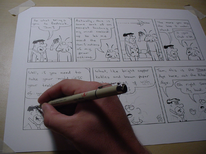
 Next is one of my favorite bits. I get out my Pigma Brush Pen. Ooooooooh. I love my brush
pen. It's great for doing thin to thick lines and vice versa. I'm better at thin to thick,
though, so I tend to draw that way. Tom's hair is the biggest example of why I use the
brush pen. It's easier than thickening his hair strand by strand with a regular pen by
far. I try and thicken exterior lines up a bit to put empahsis on the character. This is
a big "standard" in animation it seems like. But my thick lines aren't nearly as thick as
you'll see in animation. Some of my favorite artists don't use thicker lines at all on
the sihlouette. It's a matter of taste. I do it to add ephasis and depth. It sure beats
learning how to really draw. Also, I fill in any big areas of black at this point. It's
always a time saver and I'm much less likely to leave a little dot of white "unfilled"
area with the brush pen.
Next is one of my favorite bits. I get out my Pigma Brush Pen. Ooooooooh. I love my brush
pen. It's great for doing thin to thick lines and vice versa. I'm better at thin to thick,
though, so I tend to draw that way. Tom's hair is the biggest example of why I use the
brush pen. It's easier than thickening his hair strand by strand with a regular pen by
far. I try and thicken exterior lines up a bit to put empahsis on the character. This is
a big "standard" in animation it seems like. But my thick lines aren't nearly as thick as
you'll see in animation. Some of my favorite artists don't use thicker lines at all on
the sihlouette. It's a matter of taste. I do it to add ephasis and depth. It sure beats
learning how to really draw. Also, I fill in any big areas of black at this point. It's
always a time saver and I'm much less likely to leave a little dot of white "unfilled"
area with the brush pen.
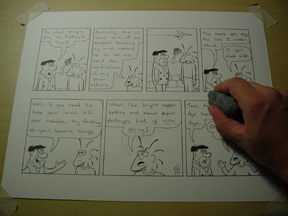 Next is the erasing. When I first started out, I liked this the best. It seemed magical as
all the crappy pencil lines disappeared and the actual comic appeared out of the morass. I
still feel that way about it, but I tend to have a LOT fewer pencil marks on my strips these
days. I eventually learned how to draw my strip with a minimum amount of hair tearing and
redrawing. When I do a strip with perspective or weird camera angles, though, it's just
like the old days. A BILLION pencil marks to erase and perspective guides to remove. Then
the comic "appears" like magic. I love that. This is also the step where I check over for
lines I forgot to ink or spots in the filled areas that need touch up. I often correct
and extend backgrounds at this point to make them fit into the characters a little more.
I use a kneaded eraser to erase. If you've never used one, give it a try, even if you
don't draw. Just go get one (they are under a buck) and use it to erase stuff. They are
WAY cool. Almost as cool as silly putty!
Next is the erasing. When I first started out, I liked this the best. It seemed magical as
all the crappy pencil lines disappeared and the actual comic appeared out of the morass. I
still feel that way about it, but I tend to have a LOT fewer pencil marks on my strips these
days. I eventually learned how to draw my strip with a minimum amount of hair tearing and
redrawing. When I do a strip with perspective or weird camera angles, though, it's just
like the old days. A BILLION pencil marks to erase and perspective guides to remove. Then
the comic "appears" like magic. I love that. This is also the step where I check over for
lines I forgot to ink or spots in the filled areas that need touch up. I often correct
and extend backgrounds at this point to make them fit into the characters a little more.
I use a kneaded eraser to erase. If you've never used one, give it a try, even if you
don't draw. Just go get one (they are under a buck) and use it to erase stuff. They are
WAY cool. Almost as cool as silly putty!
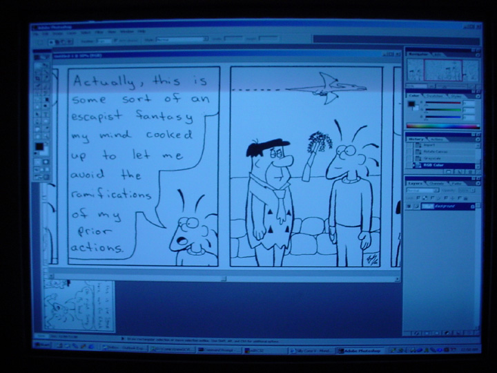
 Lastly, I scan the comic in. If this is a Sunday strip, I color it on the computer. I use
Adobe Photoshop in this process. There are usually debates as to which software is the
best on the web, but I stand by Photoshop because it's the one I learned first so many
years ago, so I use it because I've already learned a bit about it. However, there is no
real difference between it and Gimp or Paintshop Pro, really. It's just what you're
comfortable using. I scan on a Microtek Scanmaker 9600XL (thank you dot com job) at
300 dpi, then reduce it to a 72 dpi image that is 10 inches wide, or 720 pixels. I do
that because a good size monitor to aim for is 800 dpi wide. Any wider and people would
have to scroll to see the comic. People hate scrolling left to right. Top to bottom
doesn't get even a flicker of an eyebrow, but make a web-reader scroll left to right and
they will have your head on a stake in seconds. When I do my reduction, I use bicubic
resampling because it makes my handwriting the most legible. I reduce to a 16 color
palette for daily strips and 256 for Sunday.
Lastly, I scan the comic in. If this is a Sunday strip, I color it on the computer. I use
Adobe Photoshop in this process. There are usually debates as to which software is the
best on the web, but I stand by Photoshop because it's the one I learned first so many
years ago, so I use it because I've already learned a bit about it. However, there is no
real difference between it and Gimp or Paintshop Pro, really. It's just what you're
comfortable using. I scan on a Microtek Scanmaker 9600XL (thank you dot com job) at
300 dpi, then reduce it to a 72 dpi image that is 10 inches wide, or 720 pixels. I do
that because a good size monitor to aim for is 800 dpi wide. Any wider and people would
have to scroll to see the comic. People hate scrolling left to right. Top to bottom
doesn't get even a flicker of an eyebrow, but make a web-reader scroll left to right and
they will have your head on a stake in seconds. When I do my reduction, I use bicubic
resampling because it makes my handwriting the most legible. I reduce to a 16 color
palette for daily strips and 256 for Sunday.
That's it! That's all there is to drawing SCV! Now that you know how pathetically easy
it is to do, I expect some scathing letters calling me lazy and demanding more out of the
strip. Like dancing bears, full animation, and free nacho delivery. But believe me, if
I could work out free nacho delivery, it WOULD be there. Dang Nachos are good!
|
Silly Cone V is hosted on Keenspace,
a free webhosting and site automation service for webcomics.
All comics and artwork on this site Copyright 2000, 2001, 2002 Brandon
Sonderegger |
|